48 lines
1.9 KiB
Markdown
48 lines
1.9 KiB
Markdown
|
---
|
|||
|
|
title: Flex Basis Property
|
|||
|
|
localeTitle: Flex Basis Property
|
|||
|
|
---
|
|||
|
|
# Flex基础
|
|||
|
|
|
|||
|
|
`flex-basis`属性定义沿Flex容器主轴的flex `flex-item`的大小。如果`flex-direction`设置为`row` ,则主轴为水平,如果`flex-direction` `flex-direction`属性设置为`column` ,则主轴为垂直轴。
|
|||
|
|
|
|||
|
|
## 句法
|
|||
|
|
|
|||
|
|
```css
|
|||
|
|
flex-basis: auto | content | <width> | <height>;
|
|||
|
|
```
|
|||
|
|
|
|||
|
|
## flex-basis:auto
|
|||
|
|
|
|||
|
|
`flex-basis: auto`查找元素的主要大小并定义大小。例如,在水平Flex容器上,如果容器轴是垂直的, `auto`将查找`width`和`height` 。
|
|||
|
|
|
|||
|
|
如果未指定大小,则`auto`将回退到`content` 。
|
|||
|
|
|
|||
|
|
## flex-basis:内容
|
|||
|
|
|
|||
|
|
`flex-basis: content`根据元素的`flex-basis: content`解析大小,除非通过正常的`box-sizing`设置`width`或`height` 。
|
|||
|
|
|
|||
|
|
在`flex-basis`为`auto`或`content` ,如果指定了main size,则该大小将优先。
|
|||
|
|
|
|||
|
|
## 柔性基础:
|
|||
|
|
|
|||
|
|
这与指定`width`或`height` ,但只是更灵活。 `flex-basis: 20em;`将元素的初始大小设置为`20em` 。它的最终尺寸将基于可用空间, `flex-grow` multiple和`flex-shrink` multiple。
|
|||
|
|
|
|||
|
|
该规范建议使用`flex`速记属性。这有助于编写`flex-basis`以及`flex-grow`和`flex-shrink`属性。
|
|||
|
|
|
|||
|
|
## 例子
|
|||
|
|
|
|||
|
|
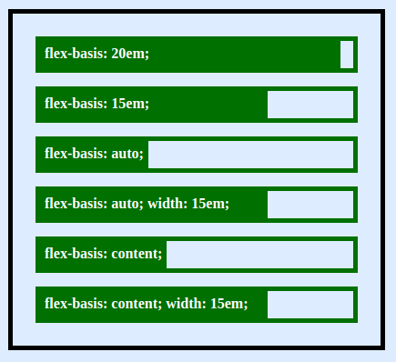
这里是各行柔性容器和各个柔性元件的行,显示`flex-basis`如何影响`box-sizing` 。
|
|||
|
|
|
|||
|
|
|
|||
|
|
|
|||
|
|
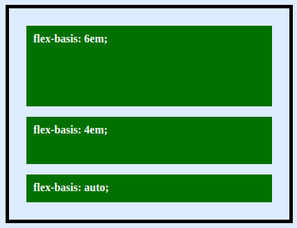
当`flex-direction`为`column` ,相同的`flex-basis`将控制`height`属性。下面的例子,
|
|||
|
|
|
|||
|
|
|
|||
|
|
|
|||
|
|
#### 更多信息:
|
|||
|
|
|
|||
|
|
以下页面的其他参考:
|
|||
|
|
|
|||
|
|
* CSS规范[级别1](https://drafts.csswg.org/css-flexbox-1/)
|
|||
|
|
* 基于[flex的](https://developer.mozilla.org/en-US/docs/Web/CSS/flex-basis#content) Mozilla Developer Network页面
|