192 lines
5.5 KiB
Markdown
192 lines
5.5 KiB
Markdown
|
---
|
|||
|
|
title: Breakpoints
|
|||
|
|
localeTitle: 断点
|
|||
|
|
---
|
|||
|
|
## 概观
|
|||
|
|
|
|||
|
|
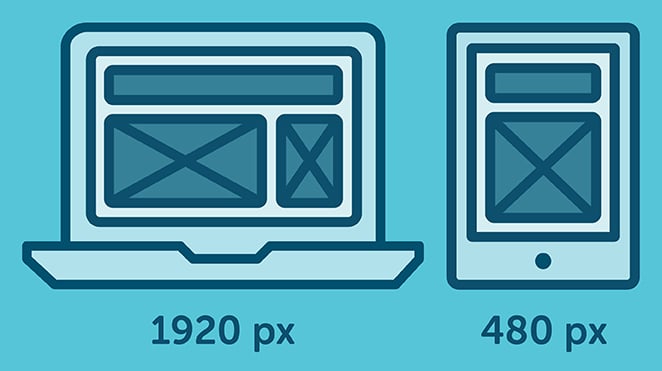
CSS断点是基于[媒体查询](https://guide.freecodecamp.org/css/css3-media-queries)更改网站布局的特定点 变得活跃。
|
|||
|
|
|
|||
|
|
通常,当您想要将网站的布局重新调整为浏览器视口的大小时,请指定断点;大多数情况下,视口的宽度。
|
|||
|
|
|
|||
|
|
例如,如果您的网站内容在狭窄的视口上看起来很棒(例如在智能手机浏览器上),但在较大的屏幕上看起来很糟糕(例如,字体尺寸太小而且难以阅读),那么你可能想为更大的屏幕引入一个新的断点,使字体更大:
|
|||
|
|
|
|||
|
|
CSS断点可以被认为是响应式网页设计的核心,因为它们定义了内容的行为或排列方式 不同的设备宽度/比例,允许您向用户显示最佳布局。
|
|||
|
|
|
|||
|
|
|
|||
|
|
|
|||
|
|
## 设置断点
|
|||
|
|
|
|||
|
|
断点基于以下任一方式广泛设定。
|
|||
|
|
|
|||
|
|
* 断点基于设备宽度。
|
|||
|
|
* 断点基于内容。
|
|||
|
|
|
|||
|
|
### 断点基于设备宽度
|
|||
|
|
|
|||
|
|
很明显,我们所有的设备都没有相同的屏幕宽度/尺寸。现在,设计决定包括一组特定设备并相应地编写css规则。我们已经有足够的设备担心了,当一个新的设备出现不同的宽度时,回到你的CSS并重新添加一个新的断点是非常耗时的。
|
|||
|
|
|
|||
|
|
这是一个例子
|
|||
|
|
```
|
|||
|
|
/* ----------- iPhone 6, 6S, 7 and 8 ----------- */
|
|||
|
|
|
|||
|
|
/* Portrait */
|
|||
|
|
|
|||
|
|
@media only screen
|
|||
|
|
|
|||
|
|
and (min-device-width: 375px)
|
|||
|
|
|
|||
|
|
and (max-device-width: 667px)
|
|||
|
|
|
|||
|
|
and (-webkit-min-device-pixel-ratio: 2)
|
|||
|
|
|
|||
|
|
and (orientation: portrait) {
|
|||
|
|
|
|||
|
|
}
|
|||
|
|
|
|||
|
|
/* Landscape */
|
|||
|
|
|
|||
|
|
@media only screen
|
|||
|
|
|
|||
|
|
and (min-device-width: 375px)
|
|||
|
|
|
|||
|
|
and (max-device-width: 667px)
|
|||
|
|
|
|||
|
|
and (-webkit-min-device-pixel-ratio: 2)
|
|||
|
|
|
|||
|
|
and (orientation: landscape) {
|
|||
|
|
|
|||
|
|
}
|
|||
|
|
|
|||
|
|
/* ----------- Google Pixel ----------- */
|
|||
|
|
|
|||
|
|
/* Portrait */
|
|||
|
|
|
|||
|
|
@media screen
|
|||
|
|
|
|||
|
|
and (device-width: 360px)
|
|||
|
|
|
|||
|
|
and (device-height: 640px)
|
|||
|
|
|
|||
|
|
and (-webkit-device-pixel-ratio: 3)
|
|||
|
|
|
|||
|
|
and (orientation: portrait) {
|
|||
|
|
|
|||
|
|
}
|
|||
|
|
|
|||
|
|
/* Landscape */
|
|||
|
|
|
|||
|
|
@media screen
|
|||
|
|
|
|||
|
|
and (device-width: 360px)
|
|||
|
|
|
|||
|
|
and (device-height: 640px)
|
|||
|
|
|
|||
|
|
and (-webkit-device-pixel-ratio: 3)
|
|||
|
|
|
|||
|
|
and (orientation: landscape) {
|
|||
|
|
|
|||
|
|
}
|
|||
|
|
```
|
|||
|
|
|
|||
|
|
> 通过这种方法,您将获得大量的媒体查询。
|
|||
|
|
|
|||
|
|
### 基于内容的断点
|
|||
|
|
|
|||
|
|
在制定或编写断点规则时,这是最优选的选择。因为只有在需要更改时才能根据特定布局调整内容。
|
|||
|
|
```
|
|||
|
|
@media only screen (min-width: 768px){
|
|||
|
|
...
|
|||
|
|
}
|
|||
|
|
```
|
|||
|
|
|
|||
|
|
> 此断点表示当设备宽度为768px及更高时,CSS将应用。
|
|||
|
|
|
|||
|
|
#### 您还可以使用断点设置范围,因此CSS仅适用于这些限制。
|
|||
|
|
```
|
|||
|
|
@media only screen and (min-width: 768px) and (max-width: 959px){
|
|||
|
|
|
|||
|
|
...
|
|||
|
|
|
|||
|
|
}
|
|||
|
|
```
|
|||
|
|
|
|||
|
|
**注意** 始终尝试根据您自己的内容创建断点,而不是设备。将它们分解为逻辑宽度而不是随机宽度,并将它们保持为可管理的数字,因此修改仍然简单明了。
|
|||
|
|
|
|||
|
|
当您想要根据屏幕大小更新样式时, **CSS断点**很有用。例如,从尺寸为1200px及以上的设备中,使用`font-size: 20px;` ,或者使用`font-size: 16px;` 。
|
|||
|
|
|
|||
|
|
我们开始使用的是大于1200px,一个普通的笔记本电脑屏幕的宽度。你可能也注意到我们提到'大于',这意味着我们在某种程度上使用了' **if-then** '语句。
|
|||
|
|
|
|||
|
|
让我们把它变成CSS代码:
|
|||
|
|
|
|||
|
|
```css
|
|||
|
|
.text1 {
|
|||
|
|
font-size: 16px;
|
|||
|
|
}
|
|||
|
|
@media (min-width: 1200px) {
|
|||
|
|
.text1 {
|
|||
|
|
font-size: 20px;
|
|||
|
|
}
|
|||
|
|
}
|
|||
|
|
```
|
|||
|
|
|
|||
|
|
**为方便起见** ,我们首先写下`.text1`基本样式...然后我们将指定`@media`规则。
|
|||
|
|
|
|||
|
|
**提示** :您可能会在一个名为“Bootstrap”的常见CSS框架上看到,他们在Bootstrap v4.0中采用了**“min-width”及更高版本** ,而旧版Bootstrap v3.0采用了**“max-width”和向下** 。 这只是一个**偏好** ,并且说' _这个_尺寸而不是'与' _这个_尺寸和大于'相比没有错。
|
|||
|
|
|
|||
|
|
使用`@media (max-width) {}` 。这是一个例子:
|
|||
|
|
|
|||
|
|
```css
|
|||
|
|
.text1 {
|
|||
|
|
font-size: 20px;
|
|||
|
|
}
|
|||
|
|
@media (max-width: 1199px) {
|
|||
|
|
font-size: 16px;
|
|||
|
|
}
|
|||
|
|
```
|
|||
|
|
|
|||
|
|
```css
|
|||
|
|
// Normal, basic styles
|
|||
|
|
// that look great on small screens
|
|||
|
|
// but not on bigger screens
|
|||
|
|
body {
|
|||
|
|
font-size: 16px;
|
|||
|
|
}
|
|||
|
|
|
|||
|
|
// Define a new breakpoint, with a media query.
|
|||
|
|
// In this case, for when the viewport's width
|
|||
|
|
// is at least 512px wide.
|
|||
|
|
@media (min-width: 512px) {
|
|||
|
|
body {
|
|||
|
|
font-size: 20px;
|
|||
|
|
}
|
|||
|
|
}
|
|||
|
|
```
|
|||
|
|
|
|||
|
|
基于内容而不是设备的断点不那么复杂。这是一个简单的代码片段,当设备的宽度超过`code 700px`大致智能手机屏幕大小时触发
|
|||
|
|
|
|||
|
|
```css
|
|||
|
|
@media only screen and (min-width: 700px) {
|
|||
|
|
something {
|
|||
|
|
something: something;
|
|||
|
|
}
|
|||
|
|
}
|
|||
|
|
```
|
|||
|
|
|
|||
|
|
您还可以设置最小和最大宽度,让您使用不同的范围进行实验。这个大致触发了smar-phone和更大的桌面和显示器尺寸
|
|||
|
|
|
|||
|
|
```code
|
|||
|
|
@media only screen and (min-width: 700px) and (max-width: 1500px) {
|
|||
|
|
something {
|
|||
|
|
something: something;
|
|||
|
|
}
|
|||
|
|
}
|
|||
|
|
```
|
|||
|
|
|
|||
|
|
#### 更多信息:
|
|||
|
|
|
|||
|
|
* [响应断点](https://getbootstrap.com/docs/4.1/layout/overview/#responsive-breakpoints)
|
|||
|
|
* [freecodecamp.org关于使用CSS断点的文章](https://medium.freecodecamp.org/the-100-correct-way-to-do-css-breakpoints-88d6a5ba1862)
|
|||
|
|
* [CSS3媒体查询](https://guide.freecodecamp.org/css/css3-media-queries)
|
|||
|
|
* [定义断点](https://responsivedesign.is/strategy/page-layout/defining-breakpoints/)
|
|||
|
|
* [CSS技巧:@media查询](https://css-tricks.com/snippets/css/media-queries-for-standard-devices/)
|
|||
|
|
* [w3schools:典型的设备断点](https://www.w3schools.com/howto/howto_css_media_query_breakpoints.asp)
|