---
id: bad87fee1348bd9acde08812
title: 使图片自适应移动端
challengeType: 0
forumTopicId: 18232
dashedName: make-images-mobile-responsive
---
# --description--
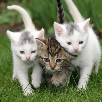
首先,在已有的图片下面添加一张新的图片。 将新图片的 `src` 属性设置为 `https://cdn.freecodecamp.org/curriculum/cat-photo-app/running-cats.jpg`。
如果图片的大小恰恰和我们手机屏幕尺寸大小一样自然是最好的。
幸运的是,现在通过 Bootstrap,我们仅仅只需要为 image 标签上设置 class 属性为 `img-responsive` , 就可以让它完美地适应你的页面的宽度了。
# --hints--
该页面共有两张图片。
```js
assert($('img').length === 2);
```
新的图片应该在旧的图片下面并且有值包含 `img-responsive` 的 class 属性。
```js
assert($('img:eq(1)').hasClass('img-responsive'));
```
新图片的 class 不应该包含 `smaller-image`。
```js
assert(!$('img:eq(1)').hasClass('smaller-image'));
```
新图片应该有一个值为 `https://cdn.freecodecamp.org/curriculum/cat-photo-app/running-cats.jpg` 的 `src` 属性。
```js
assert($('img:eq(1)').attr('src') === 'https://cdn.freecodecamp.org/curriculum/cat-photo-app/running-cats.jpg');
```
确保新的 `img` 元素有一个闭合的尖括号。
```js
assert(
code.match(/![]() /g).length === 2 &&
code.match(/
/g).length === 2 &&
code.match(/![]()
CatPhotoApp
Click here for cat photos.
Things cats love:
- cat nip
- laser pointers
- lasagna
Top 3 things cats hate:
- flea treatment
- thunder
- other cats
```
# --solutions--
```html
CatPhotoApp
Click here for cat photos.
Things cats love:
- cat nip
- laser pointers
- lasagna
Top 3 things cats hate:
- flea treatment
- thunder
- other cats
```