---
id: bad87fee1348bd9acde08812
title: Rendi le immagini responsive sui dispositivi mobili
challengeType: 0
forumTopicId: 18232
dashedName: make-images-mobile-responsive
---
# --description--
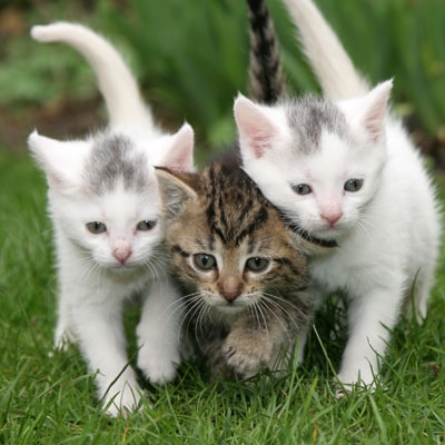
Innanzitutto, aggiungi una nuova immagine sotto quella esistente. Imposta l'attributo `src` su `https://cdn.freecodecamp.org/curriculum/cat-photo-app/running-cats.jpg`.
Sarebbe bello se questa immagine potesse essere larga esattamente come lo schermo del nostro telefono.
Fortunatamente, con Bootstrap, tutto quello che dobbiamo fare è aggiungere la classe `img-responsive` alla tua immagine. Fai questo, e l'immagine dovrebbe adattarsi perfettamente alla larghezza della pagina.
# --hints--
Dovresti avere un totale di due immagini.
```js
assert($('img').length === 2);
```
La tua nuova immagine dovrebbe essere sotto la vecchia e avere la classe `img-responsive`.
```js
assert($('img:eq(1)').hasClass('img-responsive'));
```
La tua nuova immagine non dovrebbe avere la classe `smaller-image`.
```js
assert(!$('img:eq(1)').hasClass('smaller-image'));
```
La tua nuova immagine dovrebbe avere un attributo `src` di `https://cdn.freecodecamp.org/curriculum/cat-photo-app/running-cats.jpg`.
```js
assert($('img:eq(1)').attr('src') === 'https://cdn.freecodecamp.org/curriculum/cat-photo-app/running-cats.jpg');
```
Il tuo nuovo elemento `img` dovrebbe avere una parentesi angolare di chiusura.
```js
assert(
code.match(//g).length === 2 &&
code.match(/