197 lines
5.9 KiB
Markdown
197 lines
5.9 KiB
Markdown
|
---
|
||
|
|
title: Breakpoints
|
||
|
|
---
|
||
|
|
## Overview
|
||
|
|
|
||
|
|
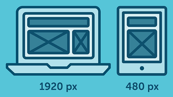
A CSS Breakpoint is a specific point in which a website's layout changes, based on a [Media Query](https://guide.freecodecamp.org/css/css3-media-queries)
|
||
|
|
becoming active.
|
||
|
|
|
||
|
|
Generally, you specify a breakpoint when you want to re-adapt the website's layout to the browser viewport's size; mostly, to the viewport's width.
|
||
|
|
|
||
|
|
For example, if your website content looks great on a narrow viewport (like on a smart-phone browser), but it starts to look bad on bigger screens (e.g. maybe the fonts' size are too small and difficult to read), then you might want to introduce a new breakpoint for bigger screens that makes the fonts bigger:
|
||
|
|
|
||
|
|
CSS Breakpoints can be considered to be the heart of responsive webdesign because they define how the content behaves or is arranged at
|
||
|
|
a different device width/scale allowing you to show the best possible layout to the user.
|
||
|
|
|
||
|
|
|
||
|
|
|
||
|
|
## Setting Break Points
|
||
|
|
|
||
|
|
Breakpoints are broadly set on basis of either of the following.
|
||
|
|
|
||
|
|
- Breakpoints based on device width.
|
||
|
|
- Breakpoints based on content.
|
||
|
|
|
||
|
|
### Breakpoints based on device width
|
||
|
|
|
||
|
|
It's quite apparent that all of our devices donot have same screen widths/ sizes. It is now a design decision to include a set of particular devices and code the css rules accordingly. We already have enough devices to worry about, and when a new one comes out with a different width, going back to your CSS and adding a new breakpoint all over again is time-consuming.
|
||
|
|
|
||
|
|
Here's an example
|
||
|
|
|
||
|
|
```
|
||
|
|
/* ----------- iPhone 6, 6S, 7 and 8 ----------- */
|
||
|
|
|
||
|
|
/* Portrait */
|
||
|
|
|
||
|
|
@media only screen
|
||
|
|
|
||
|
|
and (min-device-width: 375px)
|
||
|
|
|
||
|
|
and (max-device-width: 667px)
|
||
|
|
|
||
|
|
and (-webkit-min-device-pixel-ratio: 2)
|
||
|
|
|
||
|
|
and (orientation: portrait) {
|
||
|
|
|
||
|
|
}
|
||
|
|
|
||
|
|
/* Landscape */
|
||
|
|
|
||
|
|
@media only screen
|
||
|
|
|
||
|
|
and (min-device-width: 375px)
|
||
|
|
|
||
|
|
and (max-device-width: 667px)
|
||
|
|
|
||
|
|
and (-webkit-min-device-pixel-ratio: 2)
|
||
|
|
|
||
|
|
and (orientation: landscape) {
|
||
|
|
|
||
|
|
}
|
||
|
|
|
||
|
|
/* ----------- Google Pixel ----------- */
|
||
|
|
|
||
|
|
/* Portrait */
|
||
|
|
|
||
|
|
@media screen
|
||
|
|
|
||
|
|
and (device-width: 360px)
|
||
|
|
|
||
|
|
and (device-height: 640px)
|
||
|
|
|
||
|
|
and (-webkit-device-pixel-ratio: 3)
|
||
|
|
|
||
|
|
and (orientation: portrait) {
|
||
|
|
|
||
|
|
}
|
||
|
|
|
||
|
|
/* Landscape */
|
||
|
|
|
||
|
|
@media screen
|
||
|
|
|
||
|
|
and (device-width: 360px)
|
||
|
|
|
||
|
|
and (device-height: 640px)
|
||
|
|
|
||
|
|
and (-webkit-device-pixel-ratio: 3)
|
||
|
|
|
||
|
|
and (orientation: landscape) {
|
||
|
|
|
||
|
|
}
|
||
|
|
```
|
||
|
|
> With this approach, you will end up having a huge list of media queries.
|
||
|
|
|
||
|
|
### Breakpoints based on Content
|
||
|
|
|
||
|
|
This is the most preferred choice while making or writing the breakpoint rules. Because it is easire to adjust your content according a particular layout only when it requires a change.
|
||
|
|
```
|
||
|
|
@media only screen (min-width: 768px){
|
||
|
|
...
|
||
|
|
}
|
||
|
|
```
|
||
|
|
> This breakpoint means the CSS will apply when the device width is 768px and above.
|
||
|
|
|
||
|
|
|
||
|
|
#### You can also set a range with breakpoints, so the CSS will only apply within those limits.
|
||
|
|
```
|
||
|
|
@media only screen and (min-width: 768px) and (max-width: 959px){
|
||
|
|
|
||
|
|
...
|
||
|
|
|
||
|
|
}
|
||
|
|
```
|
||
|
|
|
||
|
|
**Note**
|
||
|
|
Always try to create breakpoints based on your own content, not devices. Break them to a logical width rather than a random width and keep them to a manageable number, so modifying remains simple and clear.
|
||
|
|
|
||
|
|
|
||
|
|
**CSS breakpoints** are useful when you want to update styles based on the screen size. For example, from a device measuring 1200px width and above, use the `font-size: 20px;`, or else use the `font-size: 16px;`.
|
||
|
|
|
||
|
|
What we have started with is from the greater than 1200px, a common laptop screen's width. You may also have noticed that we mentioned 'greater than', meaning that we are in a way using something like an '**if-then**' statement.
|
||
|
|
|
||
|
|
Let's turn it into CSS code:
|
||
|
|
|
||
|
|
```css
|
||
|
|
.text1 {
|
||
|
|
font-size: 16px;
|
||
|
|
}
|
||
|
|
@media (min-width: 1200px) {
|
||
|
|
.text1 {
|
||
|
|
font-size: 20px;
|
||
|
|
}
|
||
|
|
}
|
||
|
|
```
|
||
|
|
|
||
|
|
**For our convenience**, we write down the `.text1` basic styling first... then afterwards we will specify the `@media` rules.
|
||
|
|
|
||
|
|
**Tip**: you may see on a common CSS Framework called 'Bootstrap', that they have adopted **'min-width' and up** in their Bootstrap v4.0, as compared to their old Bootstrap v3.0 using **'max-width' and down**.
|
||
|
|
This is only a **preference**, and there is nothing wrong with saying '*this* size and less than' versus '*this* size and greater than'.
|
||
|
|
|
||
|
|
It is perfectly fine to use `@media (max-width) {}` . Here is an example:
|
||
|
|
|
||
|
|
```css
|
||
|
|
.text1 {
|
||
|
|
font-size: 20px;
|
||
|
|
}
|
||
|
|
@media (max-width: 1199px) {
|
||
|
|
font-size: 16px;
|
||
|
|
}
|
||
|
|
```
|
||
|
|
|
||
|
|
|
||
|
|
```css
|
||
|
|
// Normal, basic styles
|
||
|
|
// that look great on small screens
|
||
|
|
// but not on bigger screens
|
||
|
|
body {
|
||
|
|
font-size: 16px;
|
||
|
|
}
|
||
|
|
|
||
|
|
// Define a new breakpoint, with a media query.
|
||
|
|
// In this case, for when the viewport's width
|
||
|
|
// is at least 512px wide.
|
||
|
|
@media (min-width: 512px) {
|
||
|
|
body {
|
||
|
|
font-size: 20px;
|
||
|
|
}
|
||
|
|
}
|
||
|
|
```
|
||
|
|
|
||
|
|
|
||
|
|
Breakpoints that are based on content as opposed to device are less complicated. Here's a simple snippet that triggers when the device's width is upward of ```code 700px``` roughly smart-phone screen sized
|
||
|
|
|
||
|
|
```css
|
||
|
|
@media only screen and (min-width: 700px) {
|
||
|
|
something {
|
||
|
|
something: something;
|
||
|
|
}
|
||
|
|
}
|
||
|
|
```
|
||
|
|
|
||
|
|
You can also set a minimum and maximum width, which let's you experiments with differnt ranges. This one roughly triggers between smar-phone and larger desktop and monitor sizes
|
||
|
|
|
||
|
|
```code
|
||
|
|
@media only screen and (min-width: 700px) and (max-width: 1500px) {
|
||
|
|
something {
|
||
|
|
something: something;
|
||
|
|
}
|
||
|
|
}
|
||
|
|
```
|
||
|
|
#### More Information:
|
||
|
|
|
||
|
|
- [Responsive breakpoints](https://getbootstrap.com/docs/4.1/layout/overview/#responsive-breakpoints)
|
||
|
|
- [freecodecamp.org article on using CSS breakpoints](https://medium.freecodecamp.org/the-100-correct-way-to-do-css-breakpoints-88d6a5ba1862)
|
||
|
|
- [CSS3 Media Queries](https://guide.freecodecamp.org/css/css3-media-queries)
|
||
|
|
- [Defining Breakpoints](https://responsivedesign.is/strategy/page-layout/defining-breakpoints/)
|
||
|
|
- [CSS-Tricks:@media queries](https://css-tricks.com/snippets/css/media-queries-for-standard-devices/)
|
||
|
|
- [w3schools:Typical Device Breakpoints](https://www.w3schools.com/howto/howto_css_media_query_breakpoints.asp)
|