* Create index.md

This file introduces flex-grow: with screen shots and code samples. As with all of my commits, this is a proper contribution effort, neither copy & paste nor a links list.

* Update index.md

Added title: 'Flex Grow' to avoid Travis CL no frontmatter error.

* Update index.md

Added labels to the code blocks.

* fix: updated individual code items & sentences

Added <code></code> tags to individual code items.
Sorry for so many commits. I just saw the styling guide.

* Create flexbox-display-flex.md (#2)

* Create flexbox-display-flex.md

This file introduces the concept of display:flex and flex-direction:[row | column].

* Rename guide/english/css/flexbox-display-flex.md to guide/english/css/flexbox-display-flex/index.md

Changed the folder structure to comply with index.md.

* Update index.md

Added title: Display Flex to avoid Travice CL no frontmatter error.

* Update index.md

Added labels to the code blocks.

* fix: update individual code items.

Added <code></code> tags to individual code items.
Sorry for so many commits. I just saw the styling guide.

* Create index.md (#4)

* Create index.md

This file contains details about flex-basis, with screenshots and code samples. As with all of my commits, this is my own work not copy & paste or a lazy linkathon.

* Update index.md

Added the title; Flex Basis, to avoid Travis CI no frontmatter error.

* Update index.md

Added labels to the code blocks.

* fix: added labels for code items

Added <code></code> labels to individual code items.
Sorry for all of the commits. I just saw the styling guide. Doing my own QC.
1.9 KiB
title
| title |
|---|
| Display Flex |
Display Flex
A flexbox container can grow and shrink dynamically according to the size of the viewport.
To transform a CSS container into a flexbox container, we need to use display:flex;.
Any elements nested inside the flex container will be displayed according to any attributes given to it.
Example: CSS CODE
.container {
  display: flex;
  background: yellow;
}
.box {
  background-color: brown;
  width: 200px;
  height: 200px;
  box-sizing: border-box;
  border: solid 1px black;
  color: white;
HTML CODE
<div class="container">
  <div class="box">
    <p>Box 1</p>
  </div>
  <div class="box">
    <p>Box 2</p>
  </div>
  <div class="box">
    <p>Box 3</p>
  </div>
  <div class="box">
    <p>Box 4</p>
  </div>
</div>
The normal behaviour of divs is for them to stack vertically, but display: flex; lays out the divs into a single horizontal row, along what is called the main axis, which runs horizontally from left to right. This is because the default direction of a flex container is flex-direction: row;. It is behaving in the same way as float: left;.
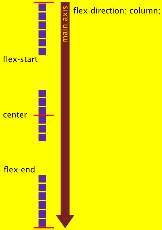
The other flex direction is column, and its main axis runs vertically from top to bottom. The images below summarise the significance of the main axis, and they also show some alignment attributes.


