90 lines
2.2 KiB
Markdown
90 lines
2.2 KiB
Markdown
---
|
|
title: Using CSS Animations
|
|
---
|
|
## Using CSS Animations
|
|
|
|
CSS animations change elements from one CSS style to another.<br>
|
|
There are no limits to how many CSS propreties you can change. <br>
|
|
|
|
## @Keyframes
|
|
|
|
CSS animations work by using keyframes, which define what style the element has at any given time.
|
|
|
|
```css
|
|
|
|
/* Using from/to */
|
|
|
|
@keyframes animationName {
|
|
from {opacity: 1;}
|
|
to {opacity: 0;}
|
|
}
|
|
|
|
/* Using Values */
|
|
|
|
@keyframes animationName {
|
|
0% {opacity: 1;}
|
|
50% {opacity: 0;}
|
|
100% {opacity: 1;}
|
|
}
|
|
```
|
|
|
|
To create a CSS animation sequence, we have different sub-properties in the `animation` property in CSS :
|
|
- `animation-delay`
|
|
- `animation-direction`
|
|
- `animation-duration`
|
|
- `animation-iteration-count`
|
|
- `animation-name`
|
|
- `animation-play-state`
|
|
- `animation-timing-function`
|
|
- `animation-fill-mode`
|
|
|
|
### Sample CSS animation sequence for move text across the screen
|
|
|
|
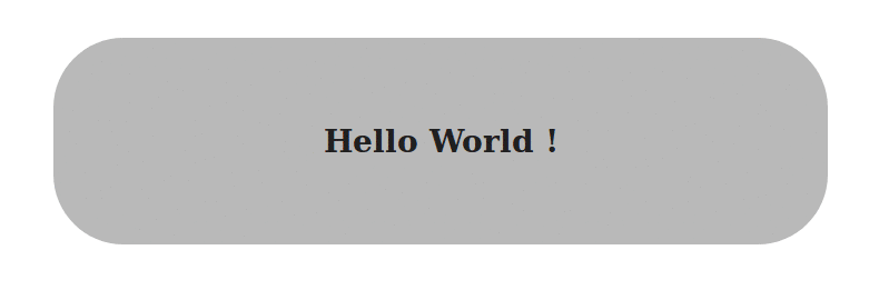
In the HTML part we will have a `div` with class `container` and a `h3` with the text `Hello World`:
|
|
|
|
```html
|
|
<div class="container">
|
|
<h3> Hello World ! </h3>
|
|
</div>
|
|
```
|
|
For the CSS part :
|
|
|
|
```css
|
|
.container {
|
|
/* We will define the width, height and padding of the container */
|
|
/* The text-align to center */
|
|
width: 400px;
|
|
height: 60px;
|
|
padding: 32px;
|
|
text-align: center;
|
|
|
|
/* Use the animation `blink` to repeat infinitely for a time period of 2.5s*/
|
|
animation-duration: 2.5s;
|
|
animation-iteration-count: infinite;
|
|
animation-direction: normal;
|
|
animation-name: blink;
|
|
|
|
/* The same can be written shorthand as */
|
|
/* -------------------------------------- */
|
|
/* animation: 2.5s infinite normal blink; */
|
|
}
|
|
@keyframes blink {
|
|
0%, 100% { /* Defines the properties at these frames */
|
|
background: #333;
|
|
color: white;
|
|
}
|
|
|
|
50% { /* Defines the properties at these frames */
|
|
background: #ccc;
|
|
color: black;
|
|
border-radius: 48px;
|
|
}
|
|
}
|
|
```
|
|
|
|
|
|
|
|
#### More Information:
|
|
- [Mozilla Developer Network Docs](https://developer.mozilla.org/en-US/docs/Web/CSS/CSS_Animations/Using_CSS_animations)
|
|
- [CSS Animations - 3d Transforms](https://3dtransforms.desandro.com/)
|