 23ca5d9cc6
* fix: imgur to s3 for chinese guide without conflict

(cherry picked from commit 21e3afaee0f23d700f76ea662bc193b392fc54ac)

* fix: remove extra links

Co-Authored-By: Randell Dawson <5313213+RandellDawson@users.noreply.github.com>

* fix: revert changes

* fix: revert changes

* fix: revert changes

* fix: revert changes
1.9 KiB
1.9 KiB
title, localeTitle
| title | localeTitle |
|---|---|
| Using CSS Animations | 使用CSS动画 |
使用CSS动画
CSS动画为网页增添了美感。 CSS动画可以将CSS样式转换为另一种CSS样式。
要创建CSS动画序列,我们在CSS的animation属性中有不同的子属性:
animation-delayanimation-directionanimation-durationanimation-iteration-countanimation-nameanimation-play-stateanimation-timing-functionanimation-fill-mode
用于在屏幕上移动文本的CSS动画序列示例
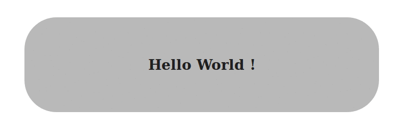
在HTML部分中,我们将有一个带有类container的div和一个带有文本Hello World的h3 :
<div class="container">
    <h3> Hello World ! </h3>
 </div>
对于CSS部分:
.container {
    /* We will define the width, height and padding of the container */
    /* The text-align to center */
    width: 400px;
    height: 60px;
    padding: 32px;
    text-align: center;

    /* Use the animation `blink` to repeat infinitely for a time period of 2.5s*/
    animation-duration: 2.5s;
    animation-iteration-count: infinite;
    animation-direction: normal;
    animation-name: blink;

    /* The same can be written shorthand as     */
    /* --------------------------------------   */
    /* animation: 2.5s infinite normal blink;   */
 }
 @keyframes blink {
    0%, 100% {              /* Defines the properties at these frames */
        background: #333;
        color: white;
    }

    50% {                   /* Defines the properties at these frames */
        background: #ccc;
        color: black;
        border-radius: 48px;
    }
 }
更多信息:
有关CSS动画的更多信息,请访问Mozilla Developer Network Docs